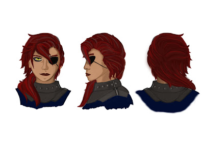
Since i wanted to design a portrait for use in the UI i offered to do a redesign as a way of testing if another point of view might make for healthy development. This is the brief design i went with to see if this got the approval of the team.
Our main character is a mercenary, a tough middle aged woman (although this is now the character the player is using in a tabletop game as part of our games meta narrative) so i wanted to convey some of this in my design decisions, the slightly tanned skin to show she spends alot of time travelling and doing work. Fierce hair and expression to show that she's a tough customer and to be eye catching in comparison to the environment. Other details which don't show in a portrait i also tried to convey in a brief sketch, such as the muscular and wide build, owing to her strength as a merc.
The team really liked the design, and so to allow our character designer to work of of this i was asked to apply this to a design sheet for the head, something which i was happy to do since my design helped fix the problem we were having. Keeping a design consistent in multiple perspectives is quite hard, making sure the various facial elements and things like hair remain the same, but i was proud of this design as it shows that i have grown much more confident in my digital art.
Finally for the purpose of a polished in game usage of the portrait, i made some further modifications to clean up the design and added a muted background for framing purposes but not as to make her less visible. I enjoyed doing the design and think it demonstrates my ability to problem solve within the team and help cover some of the shortcomings we may have, even if this extends slightly beyond my role.


No comments:
Post a Comment